When” width=”840″ height=”473″>
When it comes to building responsive websites, web developers have two powerful layout tools at their disposal: Flexbox and CSS Grid. Both methods provide efficient ways to design and structure web layouts, but they have distinct differences in terms of functionality and use cases.
Flexbox: A Flexible Layout Model
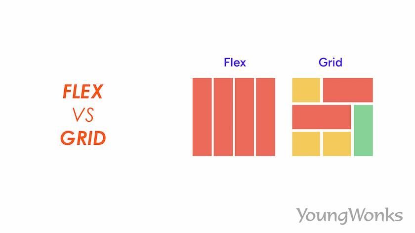
Flexbox is a one-dimensional layout model that allows you to align and distribute elements within a container along a single axis (either horizontally or vertically). It is particularly useful for creating responsive layouts with varying content sizes and screen resolutions. Flexbox offers a simple and intuitive way to create dynamic designs that adapt to different screen sizes.
Key Features of Flexbox:
Flexible box model
Alignment and distribution properties
Responsive design capabilities
CSS Grid: A Two-Dimensional Grid System
CSS Grid is a two-dimensional layout system that allows you to create complex grid structures for your website layout. With CSS Grid, you can define rows and columns, and place elements anywhere within the grid using grid lines and areas. This level of control makes CSS Grid well-suited for creating multi-dimensional layouts with precise positioning.
Key Features of CSS Grid:
Grid container and grid items
Grid lines and grid areas
Automatic placement and sizing
Choosing the Right Layout Tool
When deciding between Flexbox and CSS Grid for your responsive design needs, it’s important to consider the specific requirements of your project. Here are some factors to consider:
Flexibility:
If your layout requires flexibility in terms of content order and alignment, Flexbox may be the better choice. Flexbox excels at accommodating different content sizes and arrangements within a container, making it ideal for dynamic layouts.
Complexity:
For more complex grid structures and precise control over element placement, CSS Grid is the preferred option. CSS Grid allows you to create sophisticated layouts with multiple rows and columns, making it suitable for intricate designs that require pixel-perfect positioning.
Browser Support:
While both Flexbox and CSS Grid are well-supported in modern browsers, Flexbox has better compatibility with older browsers. If you need to ensure broader compatibility across different browser versions, Flexbox may be the safer choice.
Conclusion
In conclusion, both Flexbox and CSS Grid are powerful tools for creating responsive web layouts, each with its own strengths and use cases. Flexbox is ideal for simpler layouts that require flexibility and adaptability, while CSS Grid shines in creating complex grid structures with precise control over element positioning. Ultimately, the choice between Flexbox and CSS Grid depends on the specific requirements of your project and your familiarity with each layout method.
